Blog: Event design
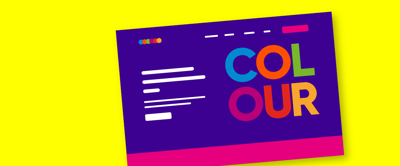
How understanding colour in event website design can get you more registrations
1 December 2025 minute read
Colour is one of the most powerful tools available in event website design. Long before attendees read a single word, colour establishes your brand identity, influences the reader’s expectations, and determines whether they stay, scroll, and ultimately convert.
For event managers and marketers – especially those working within strict brand guidelines – understanding how to apply colour effectively can significantly boost registration rates and elevate the perceived quality of your event.
Yet the utility of colour is often overlooked, or misunderstood.
Many event website pages default to corporate palettes that work well in print but fail to guide online behaviours. Others overuse brand colours in ways that hinder readability, reduce accessibility, or overwhelm users.
The key is knowing how to use colour intelligently, and deliberately.
In this post we’re going to look at some best practices, as well as some practical tips to help you build event websites that are on-brand, visually cohesive, and optimised for engagement and conversion.
1Start with your brand – but don’t stop there!
Your corporate brand colour palette should always be the foundation of your event website design. In addition to a logo and typeface, brand colours anchor an event to the broader identity of your organisation, reinforcing consistency across all your marketing channels.
However, many organisations provide only two or three ‘primary’ brand colours, which can be restrictive when used online. Strong brand colours may look great in print but can be overpowering on a web page, or even fail accessibility requirements when used for text.
Tips for you to consider
- Use brand colours for key elements, not entire backgrounds Reserve bold colours for headings, calls-to-action (CTAs), button accents, and highlighted information. Use neutral or desaturated backgrounds to improve contrast and to help avoid visual fatigue.
- Supplement your palette with neutral colours and tones Most brand guidelines allow some flexibility when employing supporting colours. Light greys, off-whites, and subtle tones ensure content remains readable while brand colours can be used to provide emphasis.
- Check for accessibility compliance early Use tools like WebAIM Contrast Checker to verify that colours used for text meet WCAG contrast standards, which is especially important for navigation menus, form labels, button text, and text content generally.
2Understand the psychology of colour – and use it to influence registration intent
Colour can evoke a range of emotional responses, and while cultural factors influence these perceptions, digital design trends have established some widely accepted associations:
Blue trust, reliability, professionalism
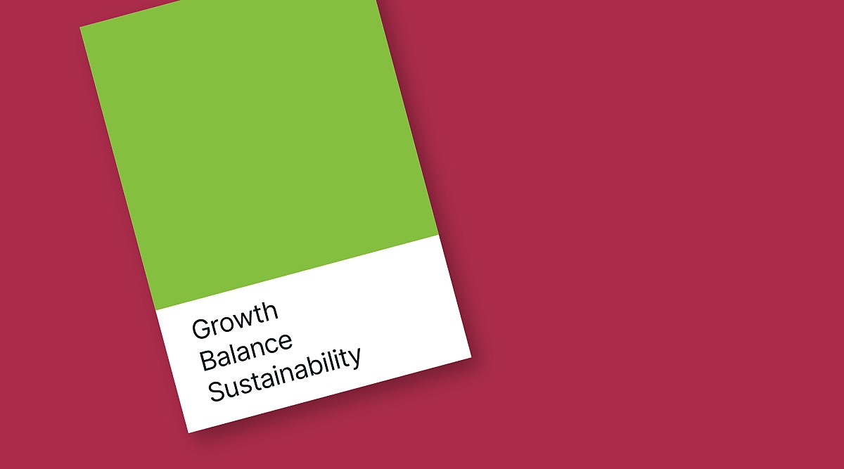
Green growth, balance, sustainability
Red urgency, passion, warnings
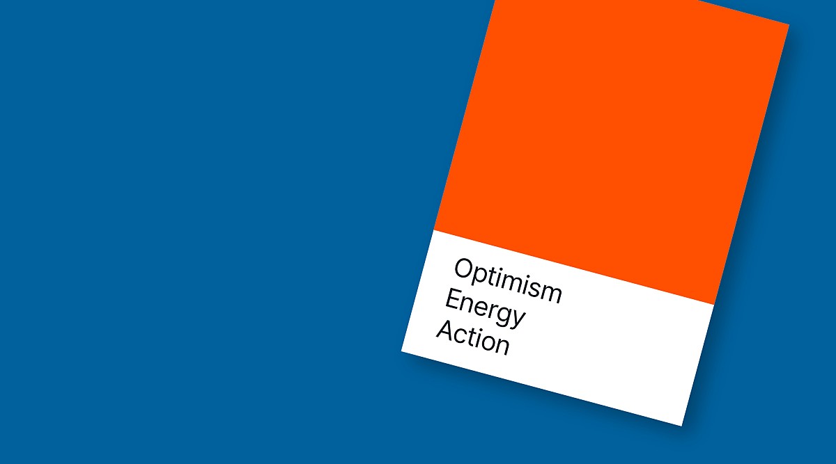
Orange optimism, energy, action
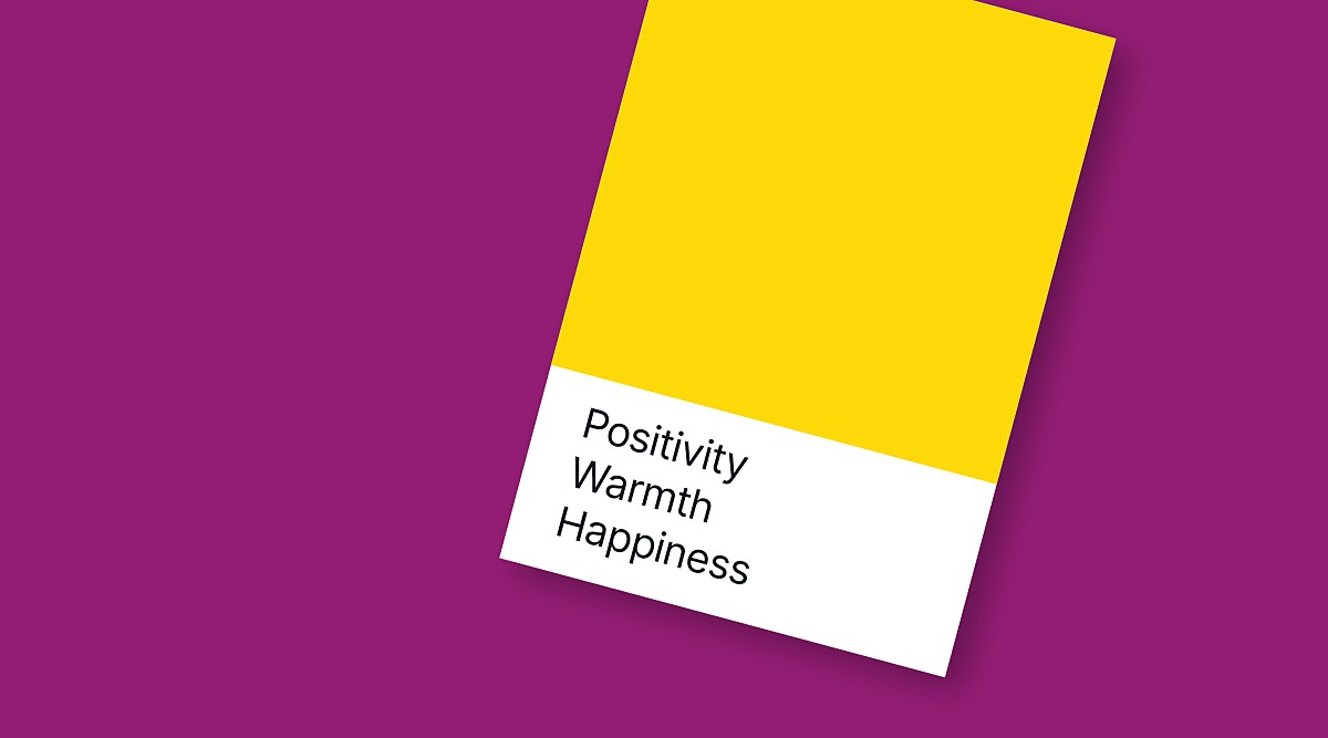
Yellow positivity, warmth, happiness
Purple sophistication, quality
Black or dark shades luxury, authority
White or light tints clarity, space, modernity
You don’t need to change your brand colours to take advantage of these associations – you just need to use them intentionally.
Tips for you to consider
- Match colour choices to your event theme For example: a cyber security summit may lean into blues and dark greys; a sustainability conference may emphasise greens and natural colours; a creative workshop might incorporate brighter colours.
- Use contrasting colours to guide the user journey A bold CTA button on a solid neutral background is more likely to be clicked than one that visually blends with adjacent content.
- Avoid using red for primary CTAs unless urgency is part of your message Red can subconsciously signal ‘stop’ or ‘error’, which may reduce conversions. This may be mitigated where red is a band primary colour; Coca-Cola is probably fine having a red CTA, but you might not be!
3Establish a clear visual hierarchy
Colour plays a major role in helping users understand what matters most and where to look first. Event websites often pack a lot of information into one page (agenda, speakers, venue, pricing, FAQs), making a clear hierarchy is essential.
Tips for you to consider
- Assign colours based on priority High-priority items (eg register buttons or limited-time offers) could use your strongest accent colour. Secondary links or information elements can use more muted tones.
- Use consistent colour coding For example: all registration CTAs could use your primary accent colour; all speaker names use your secondary colour; all section headings use a colour different to, but compatible with, the text colour. (Typographic hierarchy – text size – may also be a factor.)
- Avoid using too many colours Three to five colours will often suffice. Too many colours may confuse the information hierarchy, or simply look overwhelming.

4Accessibility is a design requirement, not an afterthought
A significant portion of event attendees access your website from mobile devices and with varying levels of visual sensitivity. For example, colour blindness affects around 8% of men and 0.5% of women. Colour contrast is essential for readability, clarity, and inclusivity. Poor accessibility doesn’t only harm usability – it can harm conversions.
Tips for you to consider
- Don’t rely on colour alone to convey meaning If you highlight agenda tracks using colour, include labels or icons as well.
- Test using light and dark modes Many users browse in dark mode, so it’s important to ensure your website’s colour palette adapts appropriately.
5Use colour to drive conversions – especially your CTA buttons
The ‘Register Now’ button is the linchpin of your most event websites. Its visibility directly impacts your registration rate.
Tips for you to consider
- Choose one prominent colour for all CTAs This ensures consistency and helps the website visitor to recognise actionable elements quickly.
- Make sure your CTAs contrast with adjacent elements Use colour to clearly differentiate your CTA, considering hue and contrast. If your brand uses dark blue, your CTA might use lime green, orange, or yellow – still on-brand but unmistakable. Position in the website page layout may also be a factor, but when your chosen CTA colour ‘pops’ against the background, it’s always going to be the most noticeable element in the scroll.
6Use colour to bring structure to complex event information
Events with multi-track agendas, exhibitor lists, or extensive speaker lineups can easily become overwhelming. Colour coding can help, but only when used systematically to support the hierarchy of the information.
Tips for you to consider
- Assign colour to agenda tracks, but use it judiciously A solid coloured bar at the top of a track may be more effective than applying solid colour to the entire agenda item. Consider using a tint of the track colour for the agenda item itself.
- Use colour to segment page sections Alternating colour tints can differentiate information and help break up long scrolls.
- Highlight important information Use a prominent colour to draw attention to updates or deadlines such as ‘Early Bird Pricing Ends Soon’.
7Enhance visual appeal with consistent imagery and colour alignment
Colour doesn’t exist in isolation – your imagery (photos of speakers, the venue, past event attendees and audiences, graphics and illustrations) has a direct impact on how colour appears on your event website pages.
Tips for you to consider
- Choose hero images that are compatible with your brand colour palette Select images with colours or casts which are complimentary for the brand and information elements displayed with, or on top of them.
- Use overlays to unify colours and tones An overlay using a brand colour, set with suitable opacity, can tie everything together and improve the readability of text on top of images.
- Avoid visually complex (busy) or colourful backgrounds behind text These reduce readability and are likely to compete with your principal messaging.
8Test, refine, and optimise, using data
Modern event platforms with website builders allow you to experiment with colours and layouts, so make sure you use these features to optimise the appearance of your event website.
Tips for you to consider
- A / B test CTA colours Sometimes small changes (eg blue vs green) can produce measurable increases in click-through rates and registrations.
- Use heatmaps to analyse where attention goes If visitors to your event website aren’t noticing key information, colour choice may need to be reconsidered alongside the positioning of the information in the scroll.
- Check mobile device vs desktop performance The reader’s environment is an unknown consideration too, where ambient light, reflections, and device size (mobile, tablet, laptop or desktop) can affect readability.
Final thoughts
For event managers and marketers, understanding colour is a powerful way to elevate branding, improve clarity of messaging, and increase registrations.
When applied intentionally – guided by accessibility, brand alignment, visual hierarchy, and conversion best practices – colour becomes more than decoration. It becomes a strategic tool that helps users navigate your content effortlessly and encourages them to sign-up.
By adopting a thoughtful colour strategy and making full use of modern event platform website design tools (such as AttendZen’s), you can create pages that are visually compelling, easy to consume, and unmistakably on-brand.
In the end, the right colour choices can make the difference between a visitor registering for your event, or not.